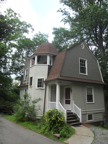
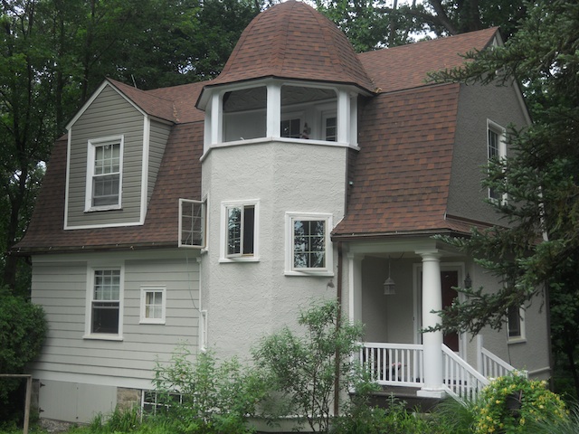
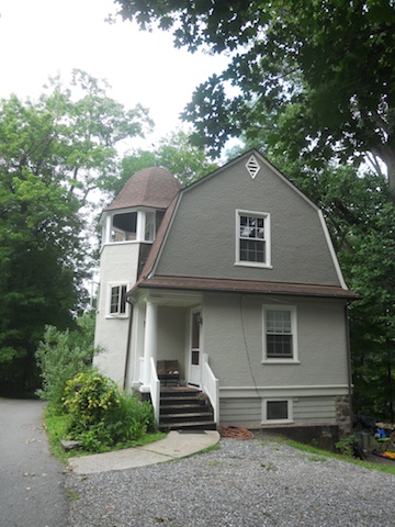
There are many ways in which to think of your house. When frustrated with the flow and function of the interior spaces, sometimes it is helpful to envision the building as a large rigid box, with many smaller somewhat flexible boxes inside that can be shifted around and fit back together inside of the whole. The result can be a completely new relationship between the rooms, and a great improvement in the function of the home. In the whole house renovation that I participated in starting this past summer, that is essentially what we did to allow for a modern kitchen to be created, and maintain certain things that the homeowners did not want to change about the original floor plan of the house.
You may remember this house. I have written about it here and here, and I am very excited to show you the end result of the kitchen renovation, which did indeed include moving the space from one front corner of the house to the other.
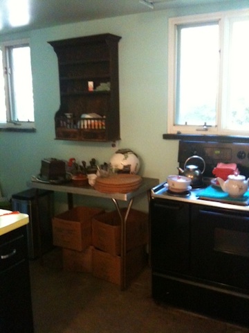
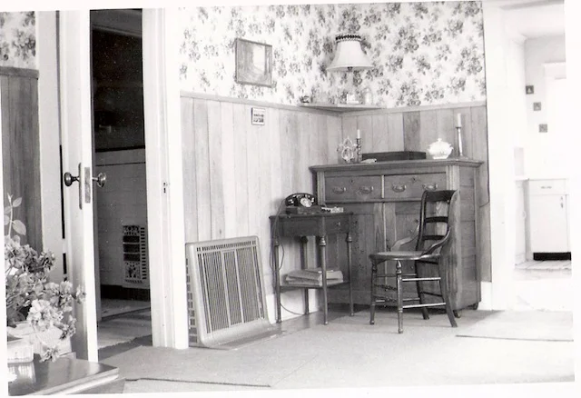
What we started with was a mid century gem of a house that had been lovingly designed by its original owner, an architect himself, for his family. The house was conceived during a time when the kitchen was for those who worked in the house, not for the lady of the house herself, and the kitchen was not the hub for family gathering that it is today. The pictures of the kitchen it its original state say it all:


The kitchen had an awkward L-shape to it, and on one end was an exterior entrance which had always been used as the main way to enter and exit by the family. You can see it at the far end of this picture....

When I proposed closing this door up, and instead turning the opening into a window so that we could have a workable kitchen layout, the response from my clients was a polite but firm "Hell No."
So, we were temporarily at an impasse.
Because I didn't want the owners to go through a costly renovation to have a pretty kitchen that would essentially function no better, I went back to the drawing board.
In our conversations about the house, I had learned that while the kitchen door had not been intended to be the front door of the house, visitors interpreted it to be just that. If they had not visited before, or weren't instructed to do otherwise, they often came here to knock, since it was the most visible door when you approached the house. The true front door was hidden from this angle, and therefore very seldom used. In the picture below you can see the kitchen door as seen from the driveway....it is the one on the right, propped open in this picture taken during construction....

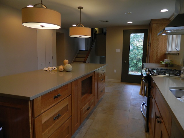
Since it was unthinkable to have this door not be a door (for functional and sentimental reasons), then why couldn't we then solve two problems at once and create an entry/foyer to be just inside of this opening, and then shift the kitchen down the front wall of the house, so that it would absorb the space that was once the entry hall?? The kitchen could then encompass a much larger and more functional space....
The answer I got this time was a resounding "YES!"
Victor Burgos, our so very knowledgeable, always patient, favorite general contractor, was there to assure that the changes could be done, and we started working out all of the details that would need to be addressed. It is amazing to me that the view of the original front door went from this:

To this (a great but sadly blurry picture of Victor and me going over details during the demolition)....

to this:
 Wow.
Wow.
And here are some more......
Before:
and after:
(The curtained window above in the "before" is the very same window here in the upper left of the frame.)
Before:
 and After....
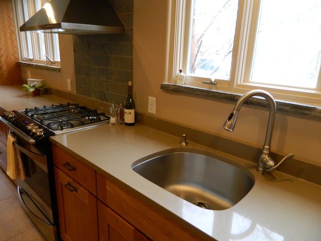 I am so pleased with the way this project turned out. The craftsmanship and materials are just beautiful.

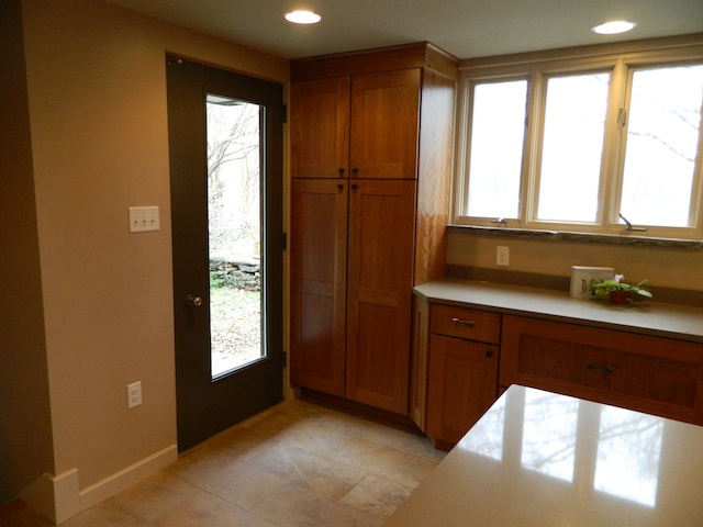
What was once the "front" door to the house is now a beautiful kitchen door, complete with a new light cut in it (asymmetrically placed to be true to the vintage of the house) to allow more natural light to enter the space.
 And the staircase, which wasn't able to be fully appreciated before in the dark front hall, now adds so much architectural interest to the kitchen.
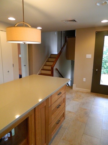 So, don't allow yourself to be boxed in! Creative thinking and not being married to the way things are, can help you to look forward to the possibilities of what could be!
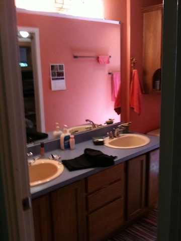
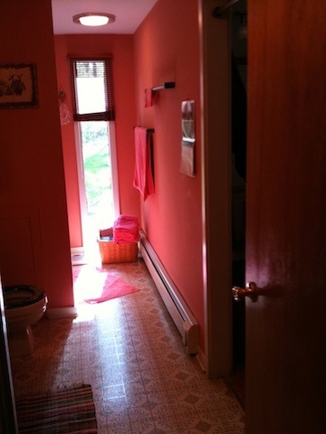 Knowing that the adjacent space was a walk-in closet featuring the same type of window, and that the room was in the front gable of the house, I knew that we had the opportunity to make some really dramatic changes, gaining vertical and horizontal space, to create a stunning and very functional master bath. YAY!
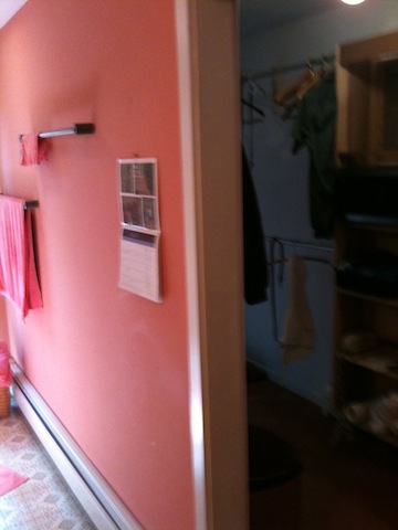
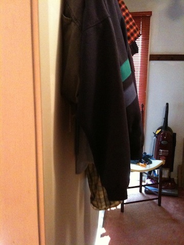
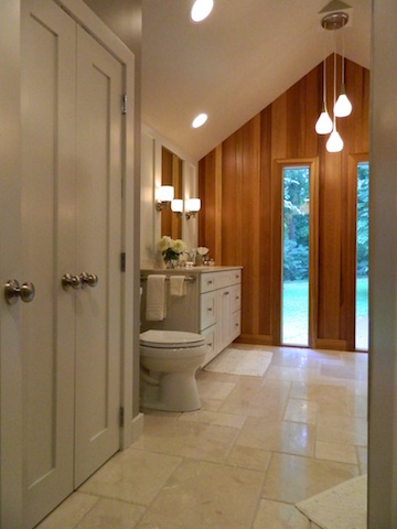
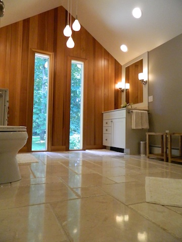
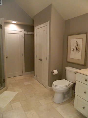
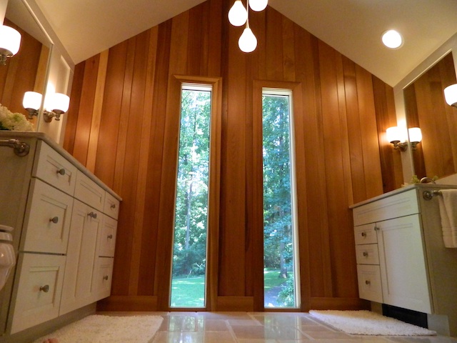
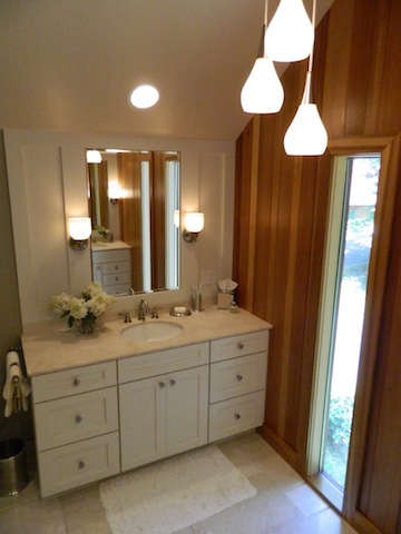
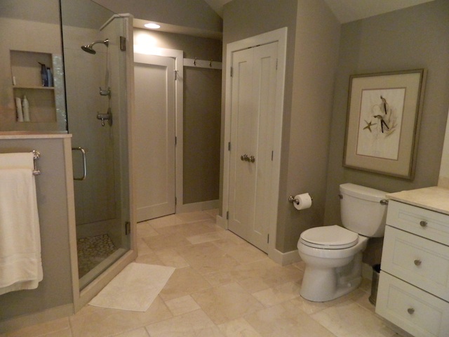 to the antique botanical print framed especially for the space, the marriage of traditional and contemporary elements into a funky, eclectic mix, reflects the style of the house and its occupants.
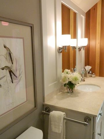
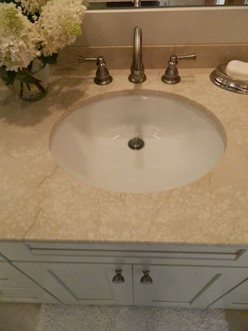 Do you have any rooms in your house that are stuck in a past decade? Perhaps a Disco Dining Room or Flashdance Family Room? :) Take heart! Transformation can happen, and what used to be an eyesore can become your favorite place in the house.


 Wow.
Wow.

 and After....
 I am so pleased with the way this project turned out. The craftsmanship and materials are just beautiful.
 And the staircase, which wasn't able to be fully appreciated before in the dark front hall, now adds so much architectural interest to the kitchen.
 So, don't allow yourself to be boxed in! Creative thinking and not being married to the way things are, can help you to look forward to the possibilities of what could be!
 Today the papers were signed and it is official! Our project house that has been sitting so pretty for so long will have someone new to love her. We are so excited!




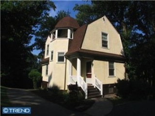 Last year I wrote a post about some clients of mine who were preparing to paint the exterior of their Dutch Colonial cottage, and had asked me to help with color selection and other details (you can see the original post