The 80's Weren't Kind To This Room
/Intense peach, powder blue, linoleum floors....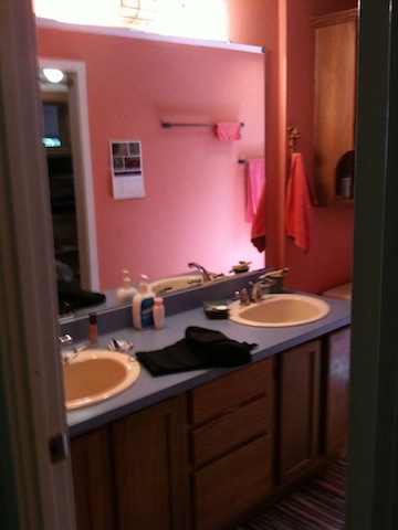
they all seemed like good ideas at the time.
This is a master bathroom that I was hired to redesign for some dear friends. Their house was built in the 80′s in a contemporary style--and they knew that the time had come for a big change.
The existing bathroom was long, low-ceilinged, and narrow, with a single tall window at the far end.
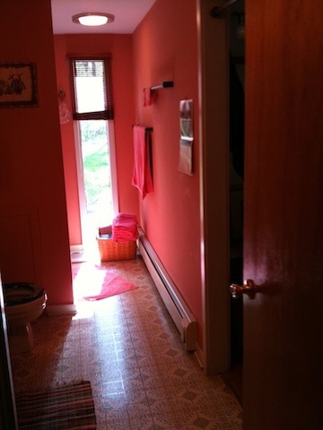 Knowing that the adjacent space was a walk-in closet featuring the same type of window, and that the room was in the front gable of the house, I knew that we had the opportunity to make some really dramatic changes, gaining vertical and horizontal space, to create a stunning and very functional master bath. YAY!
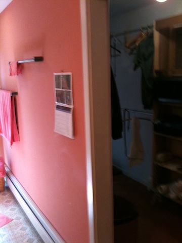
It is hard to believe that the images below are of the same room....but I know they are. I was there for each step of the transformation.
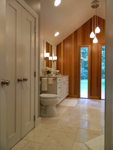
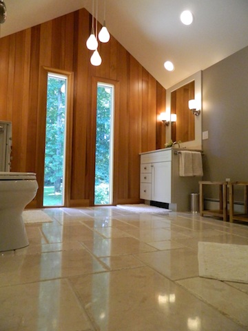
Now with a vaulted ceiling and expanded footprint, the bathroom has a luxurious and relaxing feel.
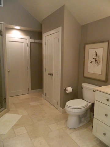
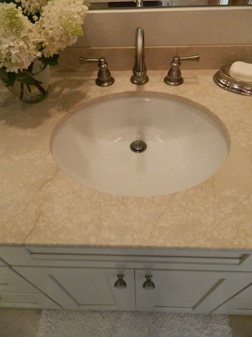
One of the things I found to be so satisfying and fun with this project was the opportunity to use many interesting and high-quality materials. From the gable end wall highlighted with clear cedar planks (further accenting its vertical lines and feeling so at home in the house's wooded setting)....
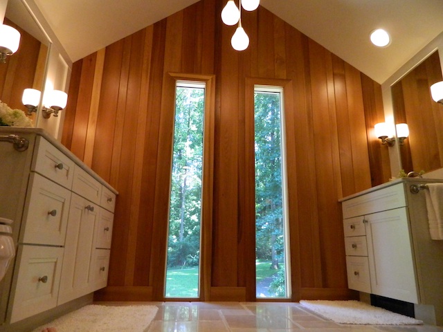
to a Mid-Century styled ceiling fixture...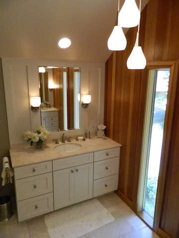
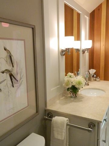
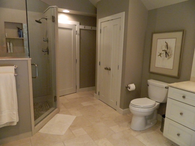 to the antique botanical print framed especially for the space, the marriage of traditional and contemporary elements into a funky, eclectic mix, reflects the style of the house and its occupants.
 Do you have any rooms in your house that are stuck in a past decade? Perhaps a Disco Dining Room or Flashdance Family Room? :) Take heart! Transformation can happen, and what used to be an eyesore can become your favorite place in the house.

