Just Wait Until You See The Difference...
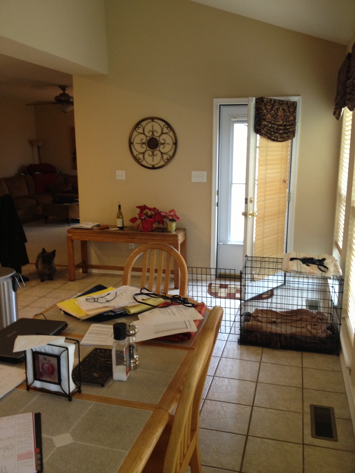
/Most times a renovation starts with one thing you know drives you nuts…it just HAS to go! For my clients that thing was the original countertops that were put in when they built their house.
They found them to be drab, along with the tile floor and all of its hard to clean grout lines.
As we talked, it seemed that other things were bugging them too--like the kitchen felt cramped, even though it was far from small--and their old kitchen table that they had owned for decades owed them nothing. It was time for that to go, too.
And what about making it easier to entertain?--something they love to do and do often. You can see in the above picture that a console table was used for a bar on such occasions, and I knew that that wall would be the perfect place to incorporate more storage and counter space for a more permanent party solution.
The adjacent family room's carpeting was worn, but my clients' sectional and custom window treatments were still in good shape, and they wanted them to stay put. I knew that with some added accessories and the new paint and flooring that was part of the upcoming renovation, the kitchen and family room could be pulled together visually into one stunning space.
For the expert craftsmanship needed to make all of the physical changes and updates to the rooms, our favorite contractor Victor Burgos was called in for the renovation.
SO, let's look at how the rooms look now that it is completed :)….
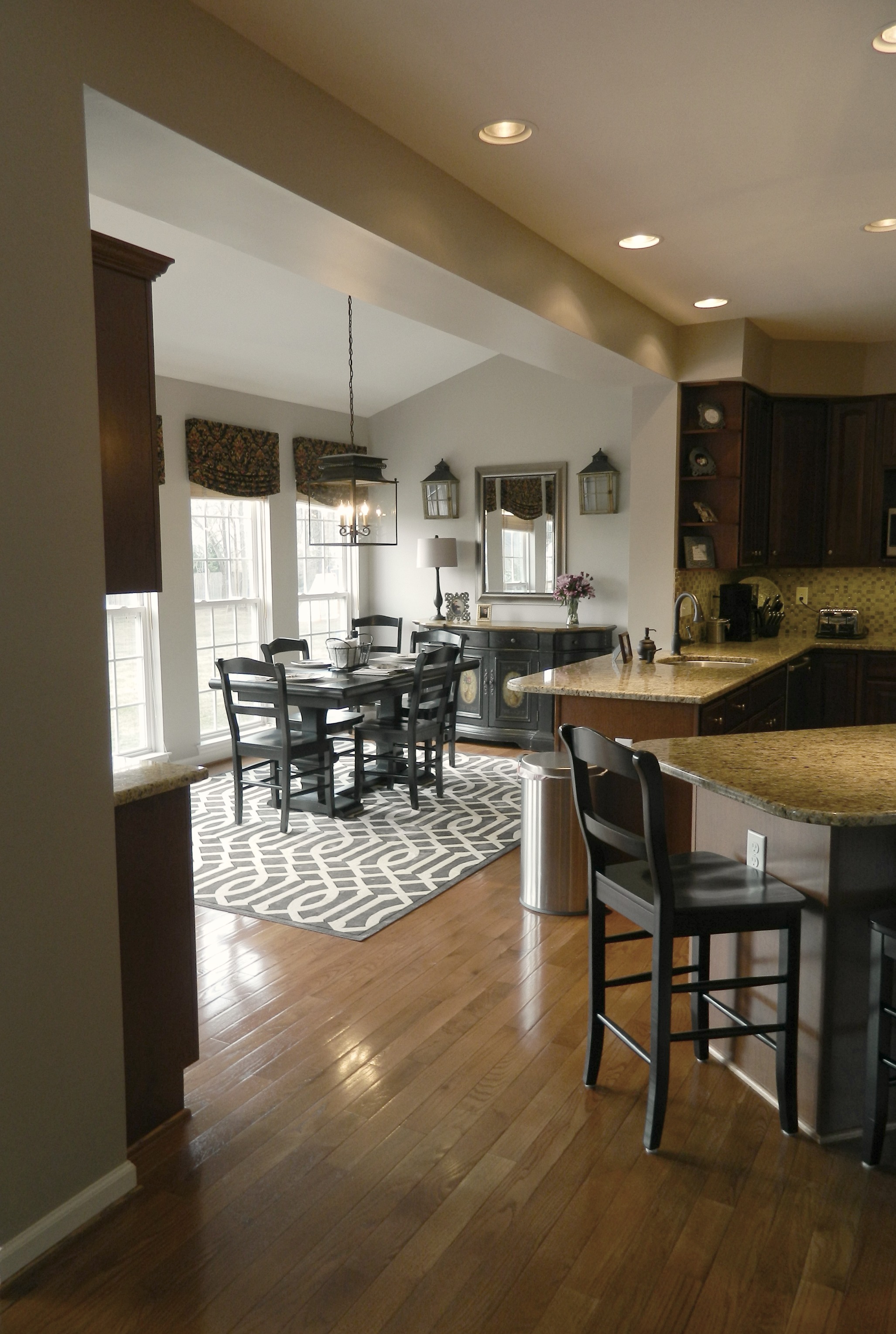
New hardwood floors throughout both rooms unifies the spaces, and along with the new granite countertops, create a much more upscale feel. You may also notice that the shelf/raised piece of countertop between the eating area and main kitchen has been leveled off, contributing to the spaces feeling less chopped up and giving a more open feel. Nothing like adding the feeling of additional square footage without having to build one more inch on!
The new bar area gives added storage and function, and beautiful new lighting (recessed, under-cabinet lighting, as well as dramatic decorative pendants) makes everything sparkle...
A change in the upper cabinetry allowed for the microwave to be elevated and free up valuable counter space….
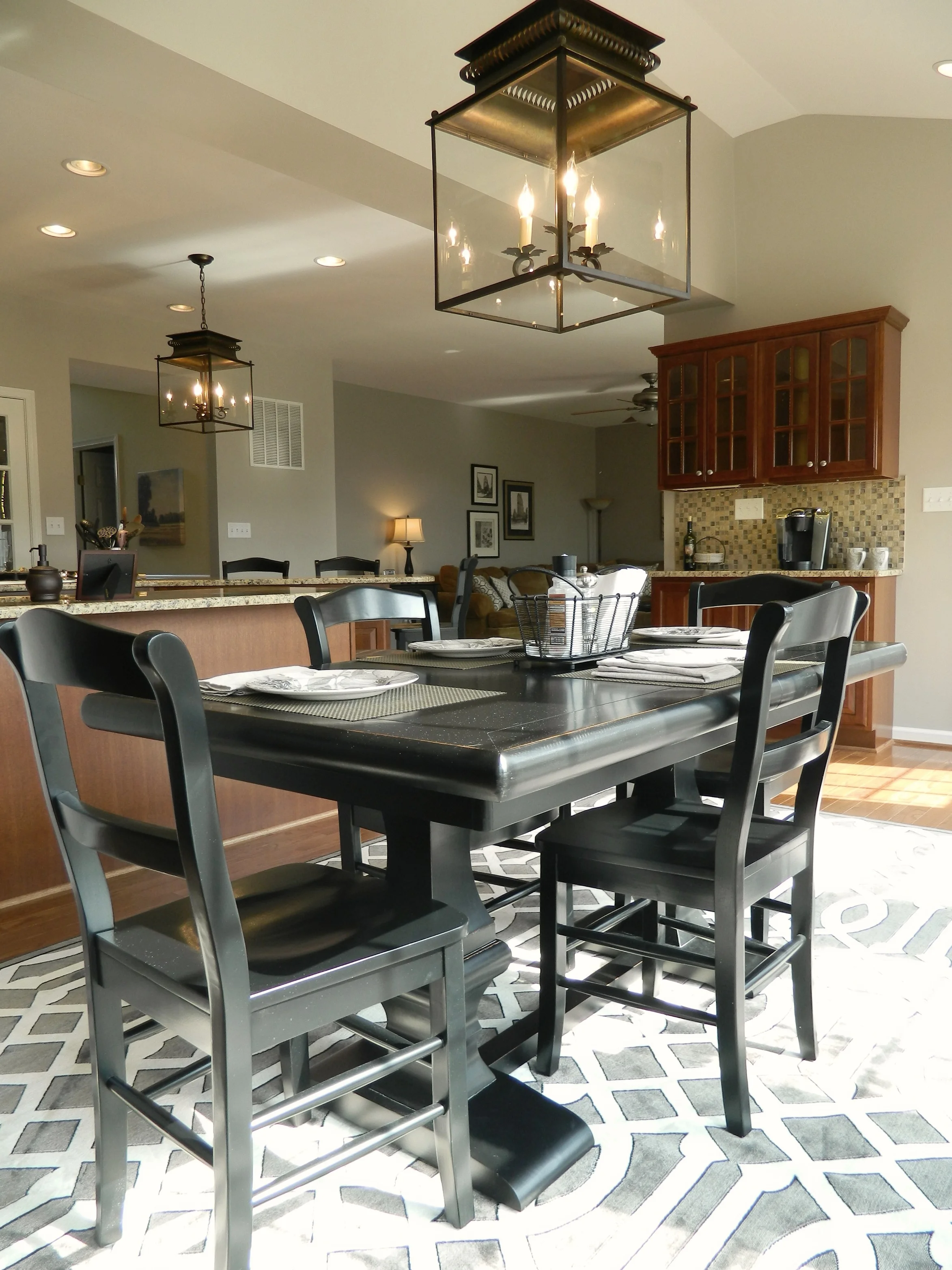
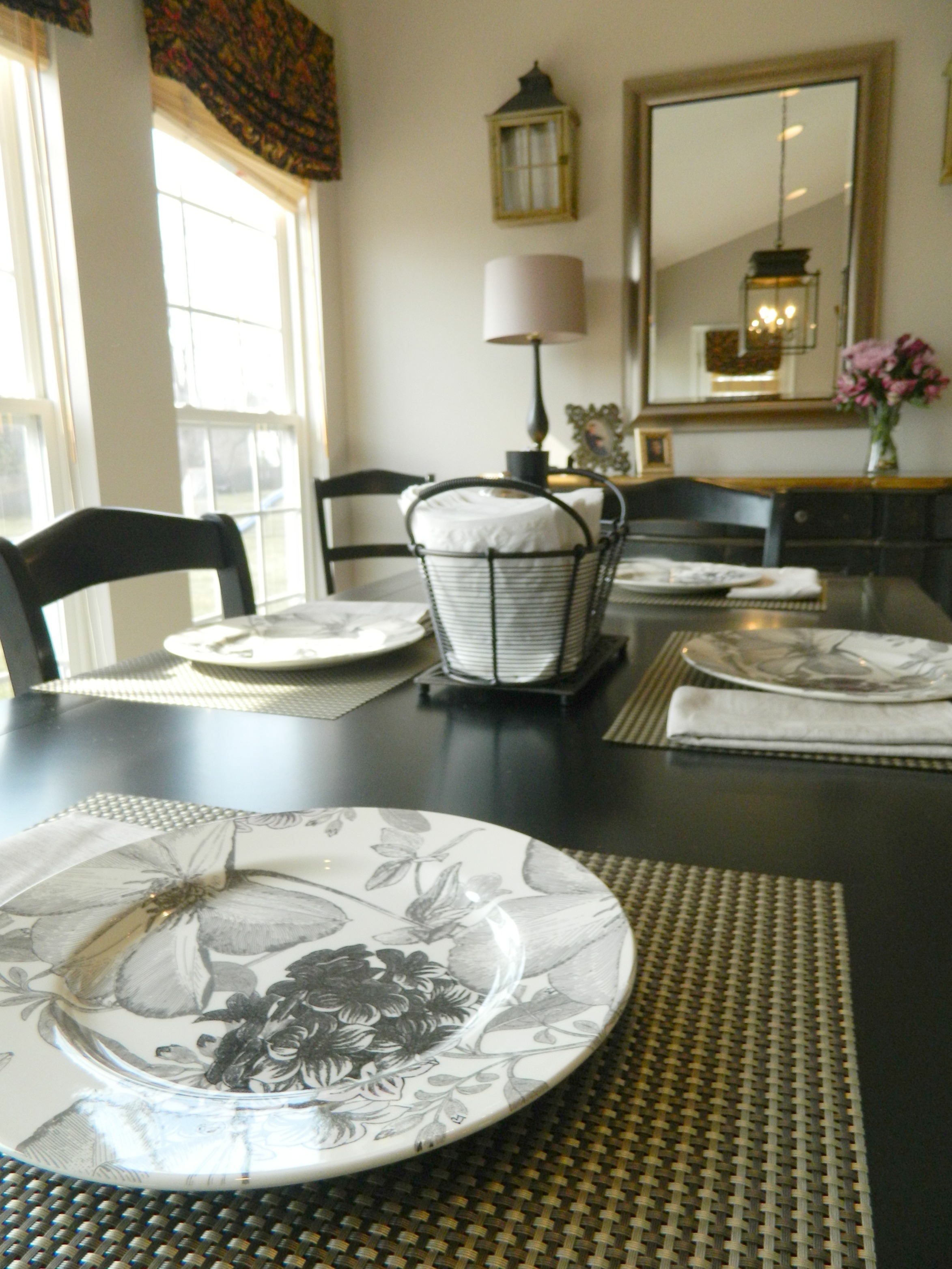
And a new table and chairs, as well as a neat-o new rug beautify the eating area. The original sideboard remains but looks completely different now with its new surrounding accents.
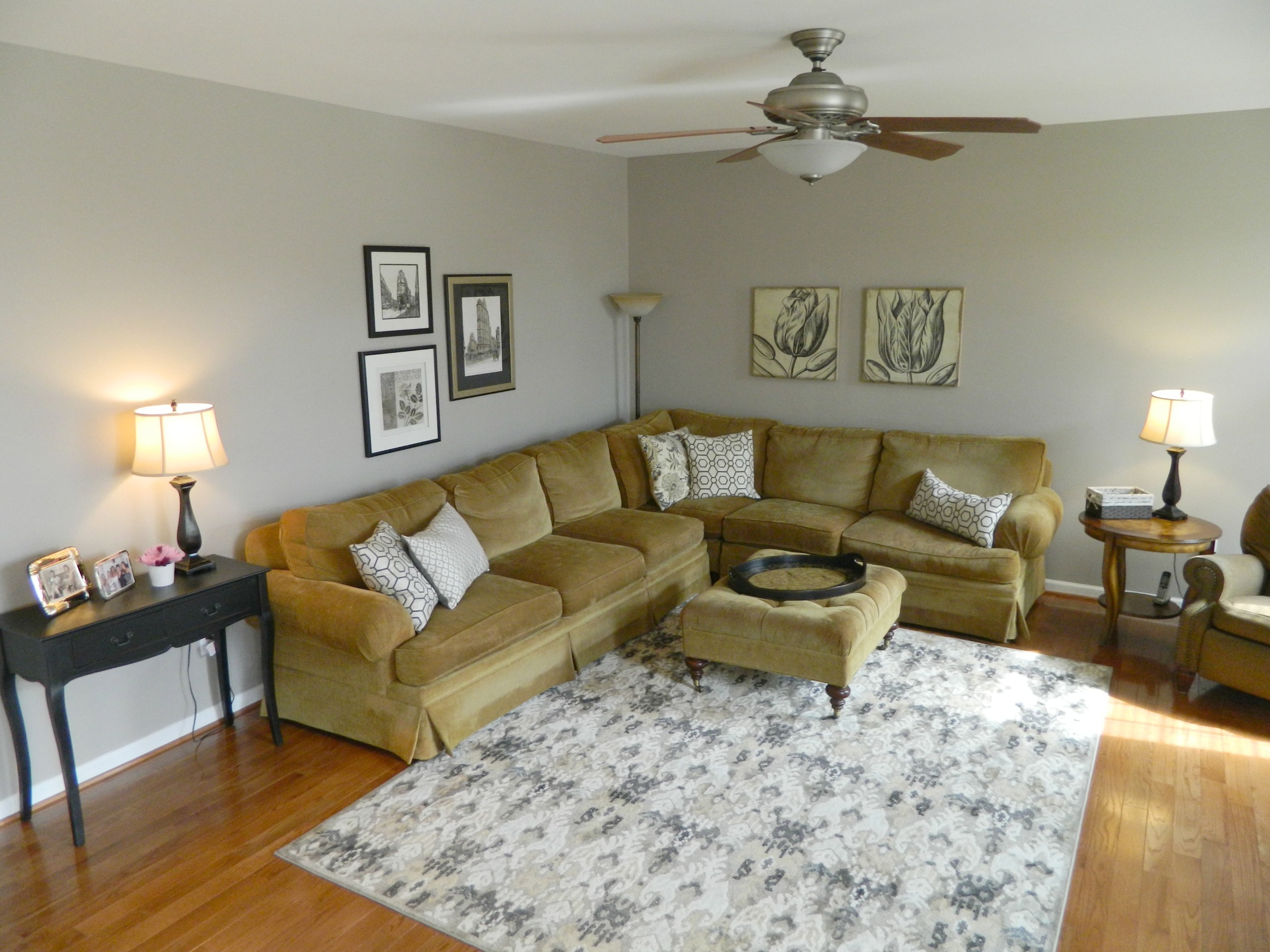
In the family room area, I wanted to create a resonance with the kitchen's decorative elements. A new rug, lamps, pillows, and artwork pull everything together and create a welcoming place to spend time and put your feet up...
It is always fun to find the little things that are such a delight and add so much to the finished product. Things like the perfect mugs...
or the most lovely plates to adorn the table...
I think Cisco approves of all of the changes. We based the color palette off of his handsome good-looks after all!


