Don't Allow Yourself To Be Boxed In
/It is easy to feel boxed in when rooms don't flow or function like we would like them to for modern life. A bit of creative thinking--thinking outside of the box--is often what is needed to marry the past with the present in a meaningful and functional way...
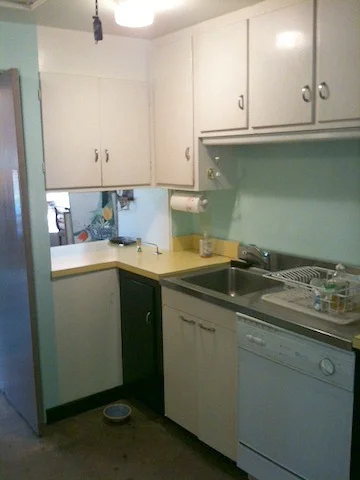
The kitchen pictured here is one that I was asked to redesign as a part of a whole house renovation a couple of years ago. The house, originally built in 1950, had been lovingly designed by its original owner, an architect himself, for his family. The house was conceived during a time when the kitchen was for those who worked in the house, not for the lady of the house --and the kitchen was not the hub for family gathering that it is today.
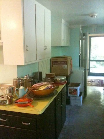
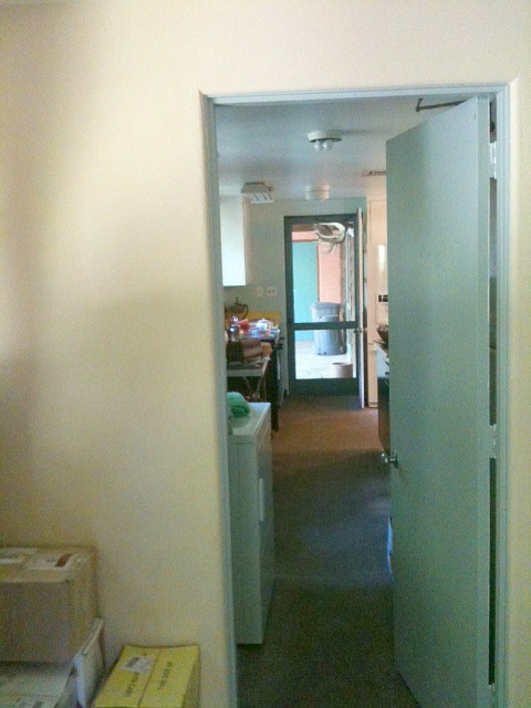
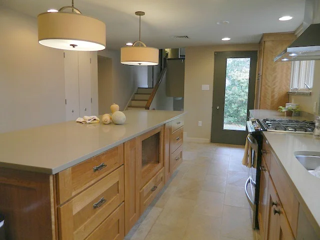
The kitchen had an awkward L-shape to it, and on one end was an exterior entrance which had always been used as the main way to enter and exit by the family. You can see it at the far end of this picture below....
When I proposed converting this door into a window (allowing for countertop and cabinetry to run underneath, since it was at the heart of where the functional kitchen workspace was to be) the response from my clients was a polite but firm "Hell No."
So, we were temporarily at an impasse.
Because I didn't want the owners to go through a costly renovation that would result in a pretty kitchen-- a pretty kitchen with a totally dysfunctional layout--I went back to the drawing board.
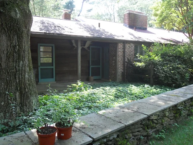
In our conversations about the house, I had learned that while the kitchen door had not been intended to be the front door of the house, visitors interpreted it to be just that. If they had not visited before, or weren't instructed to do otherwise, they often came here to knock, since it was the most visible door when you approached the house. The true front door was hidden from this angle, and therefore very seldom used. (In the picture below you can see the kitchen door as seen from the driveway....it is the one on the right, propped open in this picture taken during construction....)
When the layout of a house isn't working, it is helpful to envision the building as a large rigid box, with many smaller somewhat flexible boxes inside that can be shifted around and fit back together inside, creating a more cohesive whole.
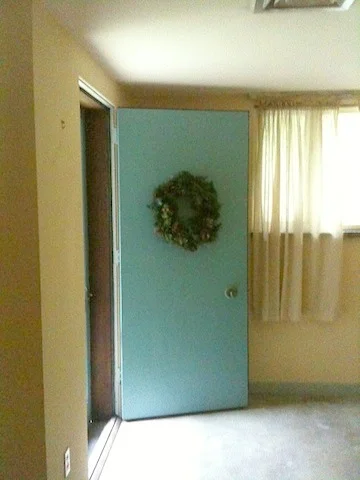
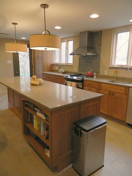
SO, since it was unthinkable to have the door above not be a door (for functional and sentimental reasons), then why couldn't we then solve two problems at once and create an entry/foyer to be just inside of this opening, and then shift the kitchen down the front wall of the house, so that it would absorb the space that was once the entry hall?? The kitchen could then encompass a much larger and more functional space....
The answer I got this time was a resounding "YES!"
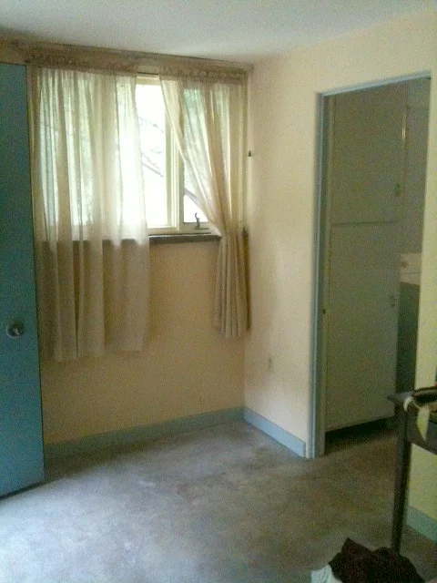
So, a seldom used and hidden entryway...
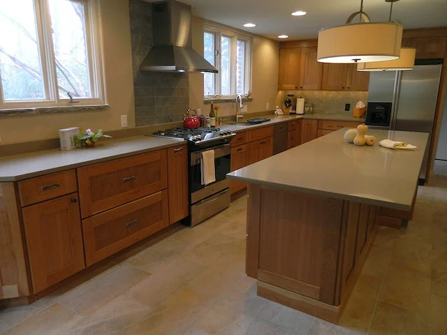
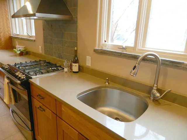
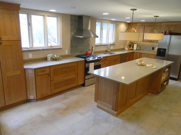
became part of a beautiful, updated kitchen:
(The curtained window above in the "before" is the very same window pictured below in the upper left of the frame.)
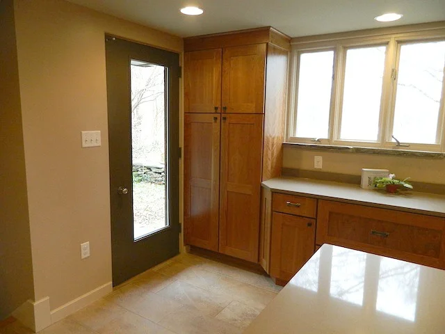
What was once the "front" door to the house is now a beautiful kitchen door, complete with a new light cut in it (asymmetrically placed to be true to the vintage of the house) to allow more natural light to enter the space.
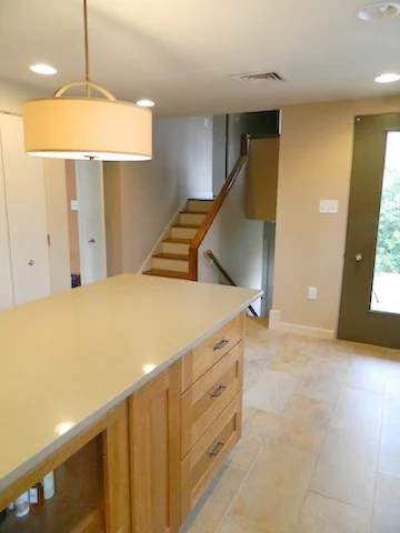
And the staircase, which wasn't able to be fully appreciated before in the dark front hall, now adds so much architectural interest to the kitchen.
The house now has an entryway where people most naturally enter the house (those photos will have to be for another newsletter :), and a functional, beautiful kitchen as well.


