Cramped? Dark? Dreary??
/Does your house feel cramped to you? Dark? Awkward? Maybe an addition is the answer.... Or maybe NOT
Whenever we become frustrated with our houses, it is really easy to blame it on a lack of space...but often putting the space we have to its best use can resolve the itch to add on (and save tens of thousands of dollars).
A house I worked on last year is the perfect example of this--a typical house built in the late 1940's-early 1950's--lots of charm, but not a lot of space compared to today's McMansion standards.
My clients called me after they had already met with an architect and had plans drawn up for a complete kitchen/downstairs renovation, including an addition.
But after we talked and I saw the spaces,
I could see why they were frustrated with the house. Of course, an addition would add space, but it wasn't going to fix the existing problems--problems that if addressed properly might negate the need for an addition in the first place.
It seemed to me that the biggest obstacle for this house working to its potential was the poor relationship between the main living areas. Narrow doorways and an odd traffic flow added to the cramped, closed off feeling.
So, what to do?
To make spaces live larger, you want to create longer sight lines, so that rooms can share visual space and also natural light...a huge component of making a house feel spacious and welcoming.
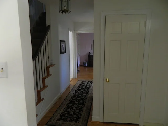
The existing front hall was dark and felt cut off from the rest of the downstairs--not the most welcoming thing to come home to each day.
To make things come together, I knew that the wall dividing the front hall and the back of the house had to go....
and the resulting shared light and space speak for themselves.
The remaining doorways were widened to help with this as well, and the wall separating the kitchen was removed just as on the architect's original plans...
The result is a first floor that flows beautifully, sharing light, long views, and a feeling of a space that lives much larger than it actually is.
In the new kitchen, we created a layout that would keep the existing exterior openings with all of their beautiful sunlight and views (changing a door to a window, and shortening the large picture window) but still give us acres of countertop, lots of cabinetry and a super functional work area despite losing a whole wall....
The addition has been subtracted from the plans for now, and I am proud to say that the house no longer feels dark or cramped, but rather light and spacious. And because they didn't have the added expense of new foundation, walls and roof spent for an addition, money was directed into beautiful craftsmanship and the best possible materials. Stunning!


