Some Summertime Simplicity--PLEASE!

Hello Friends!

It has been a long few months, wrapped in a challenging couple of years…and I don’t know about things around your house—but the rooms in mine have certainly needed a little extra love from time to time in these past many months.

As the warmer days set in, I recently made a pledge to myself to focus on my own house yet again, to give it some love and attention so that it in turn can support me.

I was longing for some summertime simplicity…and I thought of you, and wondered if maybe you are too?

Simple things like…

  • rooms that feel open, airy & welcoming.

  • time at home that feels relaxing and rejuvenating.

  • adding balance back into the way your house functions and supports you.

With all the busyness, uncertainty, changes & new challenges, it is easy for our houses (which ideally would be lovely personal spaces that center us and help us heal)—to become just another thing that can be overwhelming, rather than calming.

One of Revealing Redesign’s core missions is to help you make your home feel good & make sense.

How can we help you refocus and rededicate your space so that it makes you feel nurtured and supported?

While our renovation programs are completely booked through the summer, our House Whisperer Consultations, which are a series of two hour appointments with me, are still scheduling…and what a difference they make!

Focusing on things like paint color selection, reworking rooms, reorganizing, selecting light fixtures or furniture pieces, and just figuring out why a room has never worked well or been comfortable to spend time in are all things we can tackle in these sessions.

If you are interested, send me an email today at erin@revealingredesign.com —I look forward to hearing from you!

New Year, New Rooms... (BEFORE & AFTER!)

If you are anything like me, when your house frustrates you, you dream of more space, bigger rooms…wide open spaces with LOTS of elbow room and LOTS of possibility.

What we often forget is while we dream of space, what our soul really wants is coziness and comfort, things that we don’t often feel if we are in a big open room.

My clients had just that—a lovely, big space they had added on a few years ago, with lots of beautiful views, high ceilings, and tons of natural light…but they didn’t feel at home in the space at all.

It was a lot of fun working on the plans so that we could help them create cozy rooms within the room…creating order, balance and peace so that they could finally really enjoy all that space.

With the room’s unusual configuration, it had been hard for my clients to figure out how best to furnish it…

To make sense of things, we created three distinct areas— a sitting area, a family room/TV nook, and a dining area, so that each space could serve them well.

Here is how the spaces look now:

THe wide open space now has lovely smaller “rooms” within it that make you want to sit and stay awhile.

We added a custom sectional sofa and chair to the TV/Family room area that creates a lot of seating within a small footprint, and creates a lot of definition at the same time.

The smaller sitting area takes full advantage of views of the garden, and is an intimate place to sit and read, or visit with friends.

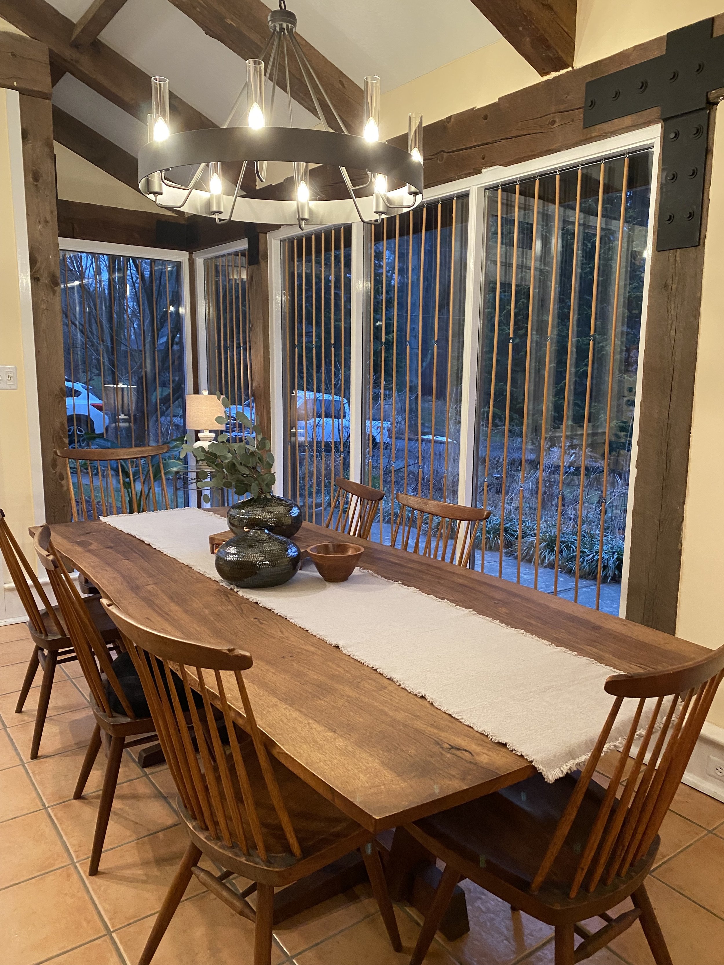
THe new chandelier over this beautiful table creates a sense of shelter, making the dining area all the more inviting.

In addition to these spaces, we also reworked the entryway’s open closet, creating a simple storage solution using pretty labeled baskets which contain things that used to be out in the open. Now, with the easy to read labels, the items inside are easy to find but look nice and tidy when you come in the front door.

We also tucked some new hooks in the inside corners of the closet, so that items can be hung out of sight creating a more calm & tidy look.

Lots of baskets to corral all sorts of things, a tray to drop mail and keys when you come through the door—what more could you want in an entry? :)

Layers of texture, defined cozy spots to sit in and feel sheltered, new storage solutions, and lovely soft lighting have transformed these areas into SOULFUL spaces that will be enjoyed for years to come!

For the love of a Project House...

IMG_2686.jpeg

Last fall I was contacted by a lovely couple who just loved their house…but they knew it was time to move on.

It was a difficult decision to sell their beloved house, especially since they thought they would live there forever and always…but some health challenges changed their plans, and they gave me a call.

I was so honored that they asked me if I was interested. They knew I would want to preserve and respect the original 1920’s character of this little gem, and would freshen her up and prepare her for her next chapter.

IMG_2198.jpg

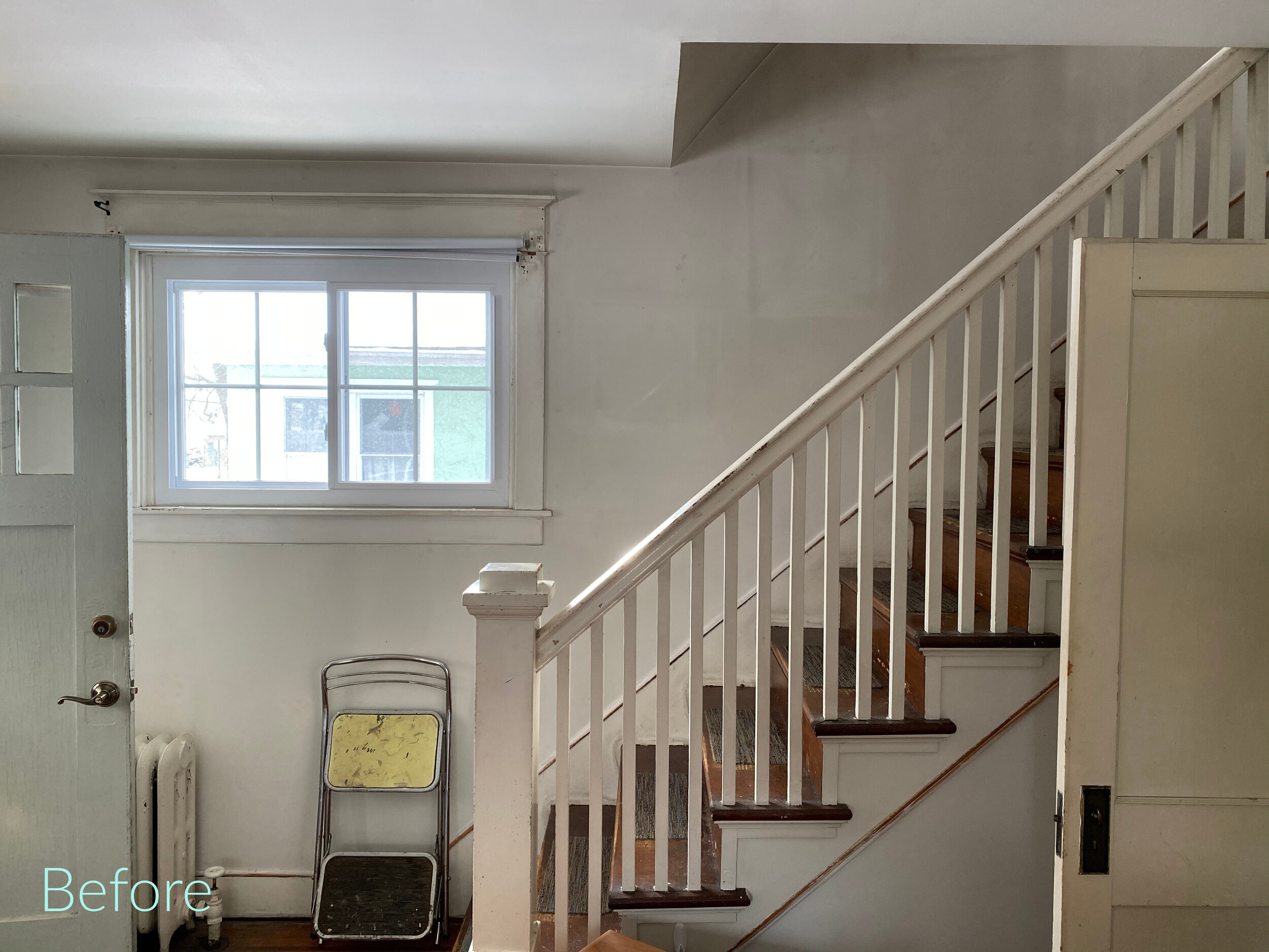
As I began work on the house, I planned to to simply reveal the original charm that was already there—show off the beautiful windows, freshen up the gorgeous trim with fresh paint…

IMG_3700.jpg
IMG_3178.jpg
IMG_3727.jpg

And sand down the floors to reveal their natural beauty.

IMG_2717.jpg
IMG_3704.jpg

The cherry inlay was barely visible in the living room and dining room when we first started work on the house, but after the floors were refinished that detail just shone.

IMG_2715.jpg

I was careful to put in new fixtures that looked like they would fit in with the vintage of the house…

IMG_9677.jpg

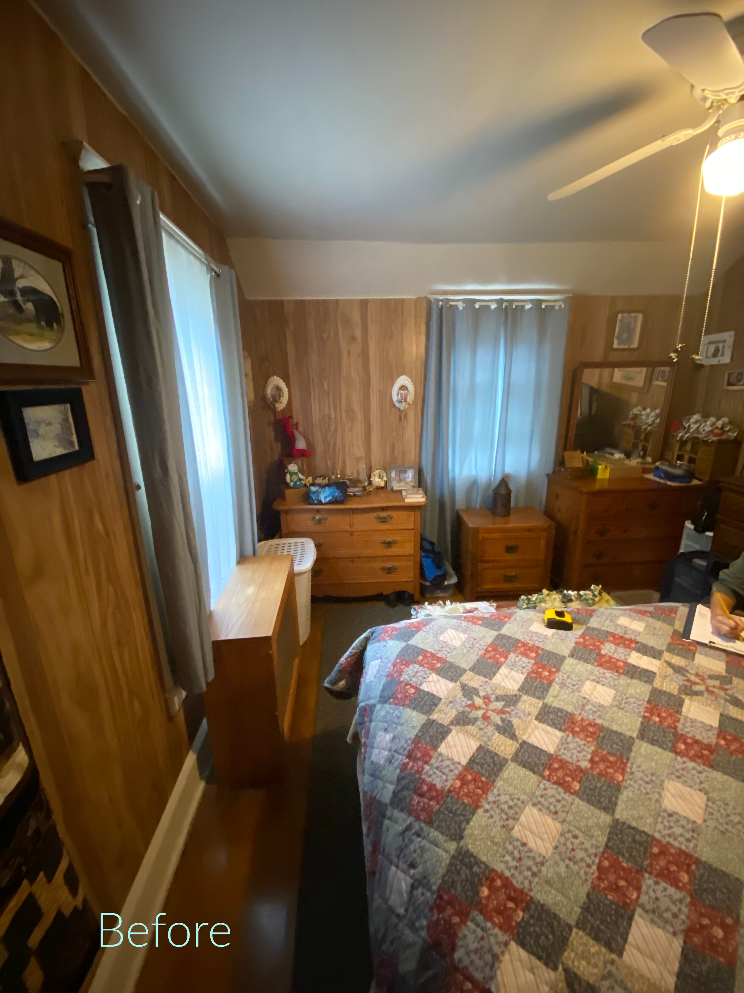
Each room was lightened and brightened by the fresh paint. The dark panelling was no match for the paintbrush…

IMG_9667.jpg
IMG_2696.jpg

In the bathroom, we used a beautiful hexagonal marble tile, much like what would have been used when the house was originally built in 1927, and we scrubbed and polished the old tub back to its former glory.

In the kitchen, we had a very limited footprint to work with, but I knew I wanted to bring in a dishwasher—a MUST for the young couple whom I envisioned would be purchasing the house from me…

IMG_2941.jpg

We carved out just enough space by using retro-styled appliances (my favorite!) that fit the scale of the kitchen perfectly, and added so much style. Over the dishwasher, much needed counter space went in providing for a work surface next to the range.

IMG_9675.jpg

A vintage cabinet that one of my clients was getting rid of rounded out the wall!

The opposite wall was all original cabinetry and a beautiful vintage porcelain sink, which you know I wanted to preserve…

We cleaned the cabinets up with a fresh coat of paint, and put in new quartz countertops to finish the space beautifully. OH…and the new tile floor! The black and white pattern gives the room a fun graphic punch and kicks the whole thing up a notch.

IMG_3766.jpg

Soon it will be time for us to find our next Project House! 🏡

Who do you know that has a house they love, but for whatever reason they feel it is time to move on?

For these homeowners we provide a trusted service in allowing them to sell their houses as is—so they can move onto the next chapter—all while knowing they are passing their beloved home on to someone who will love it as much as they did for all those years. ♥️🏡♥️

Redesign in A DAY!

When I first started Revealing Redesign waaay back in 2006, one of the things that I most wanted to do was to show people how much potential the rooms they currently felt “meh” about REALLY had…you know, right there, just underneath the surface.

I knew that without much fuss, in just a little bit of time— with a lot of can-do attitude, elbow grease and creativity— a room can go from “just okay” to sensational. Truly.

That is how our Redesign in a Day service came to be.

IMG_5128.jpg

Whenever we go out for a Redesign in a Day service, I can’t believe I get to do this for a living…and that having this much fun is actually legal. :)

The space shown here belongs to one of our favorite clients. She knew that she loved many elements in her family room and kitchen, but didn’t really love the way the rooms looked overall…

AND since they were preparing for a big family event at the house, she wanted it to look extra special and extra pulled-together.

IMG_5134.jpg

The bones of this room were already in place, with a beautiful colorful rug, a new sofa and chairs, and quite a few stylish accents…but something was still missing.

IMG_5135.jpg

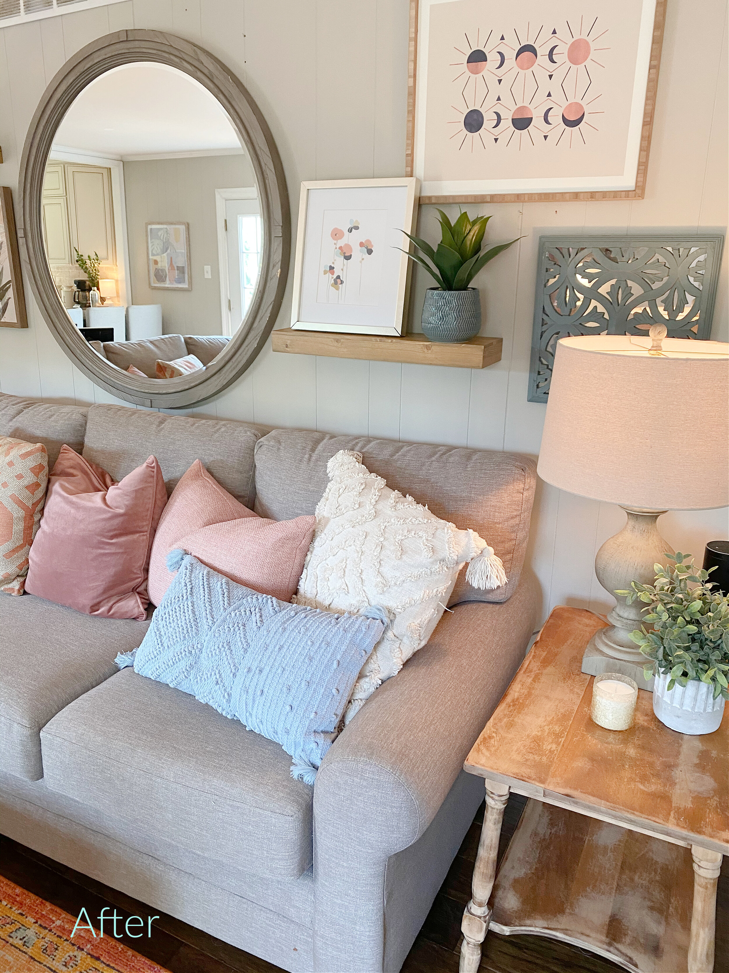
To make the room feel complete, we brought more colorful pillows, more artwork to pull those colors up on the wall, and more life and lighting in the form of fresh flowers, plants, and new lamps into the space to giving a more welcoming feel.

With such a large wall over the sofa, it was important to add dimension and depth…so floating shelves were also added to round out the grouping.

Guests were sure to wander into the kitchen as well, so we rounded out artwork that was already on hand, added a table runner with accessories, and repositioned the table so that it felt more balanced in the space…

IMG_4062.jpg

By the end of the afternoon, the spaces were all pulled together and ready to party…

IMG_5144.jpg

AND also ready to be enjoyed for months and years to come!

Yay!

My New Office 2021

Well, hello there friend!!

It has been waaaay toooo long since I have dropped in to say hi!

I am excited to say there has been so much change and growth with Revealing Redesign over the past year, and today I am sharing one of the fun outcomes of that--my new office! (Or as I sometimes refer to it: "RR World HQ" hahah).

Come take a little tour with me, and be inspired by how you can repurpose furniture from your family's past, or rethink rooms that aren't being used much so that you can make the most of all that space, history, and character.

YES!!

HERE is where you can see our tour!

OH, and HERE is the link for Amy's Upcycles, where I got my custom farmhouse table. :)