• Skip to main content
  • Skip to footer

Revealing Redesign

Pennsylvania Interior Design Studio

  • Home
  • About
    • FAQ
  • Work
  • Services
  • Process
  • Journal
  • Inquire

Creative Solutions

The 80’s Weren’t Kind To This Room

August 9, 2012 by Erin Cochran

Intense peach, powder blue, linoleum floors….
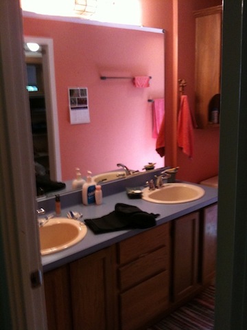
they all seemed like good ideas at the time.

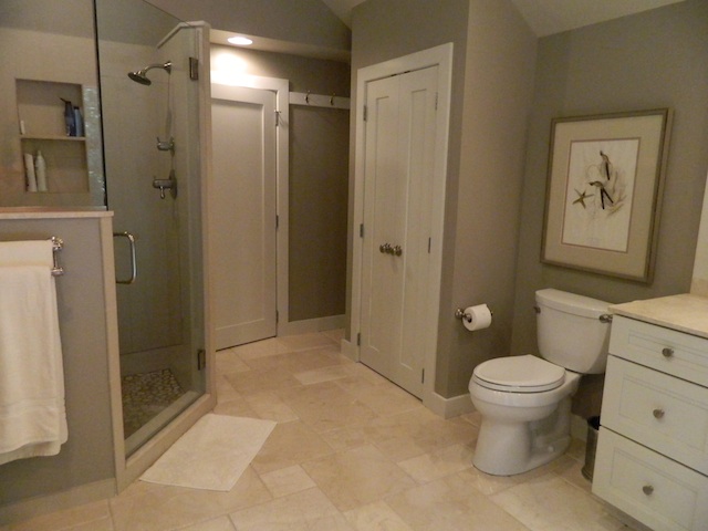
This is a master bathroom that I was hired to redesign for some dear friends.  Their house was built in the 80′s in a contemporary style–and they knew that the time had come for a big change.

The existing bathroom was long, low-ceilinged, and narrow, with a single tall window at the far end.
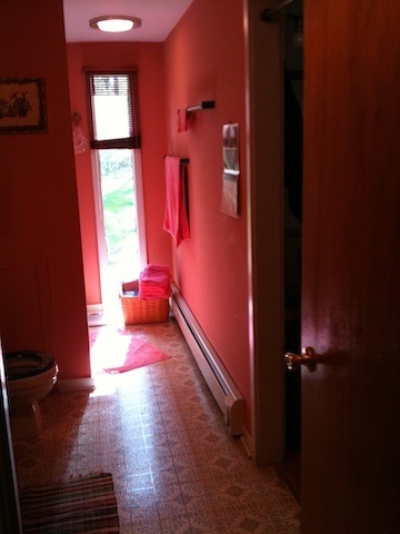
 

Knowing that the adjacent space was a walk-in closet featuring the same type of window, and that the room was in the front gable of the house, I knew that we had the opportunity to make some really dramatic changes, gaining vertical and horizontal space, to create a stunning and very functional master bath. YAY!
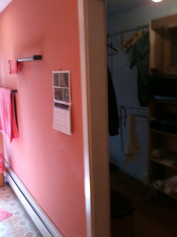
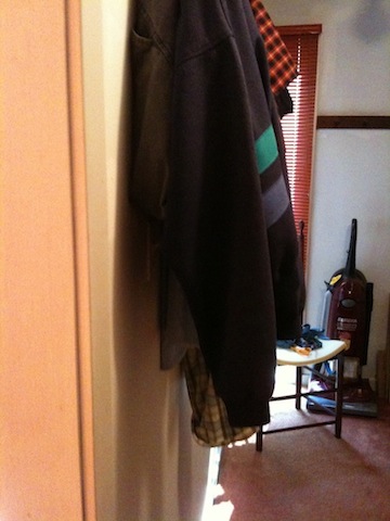
It is hard to believe that the images below are of the same room….but I know they are. I was there for each step of the transformation.
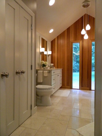
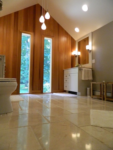
 

Now with a vaulted ceiling and expanded footprint, the bathroom has a luxurious and relaxing feel.
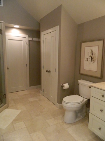
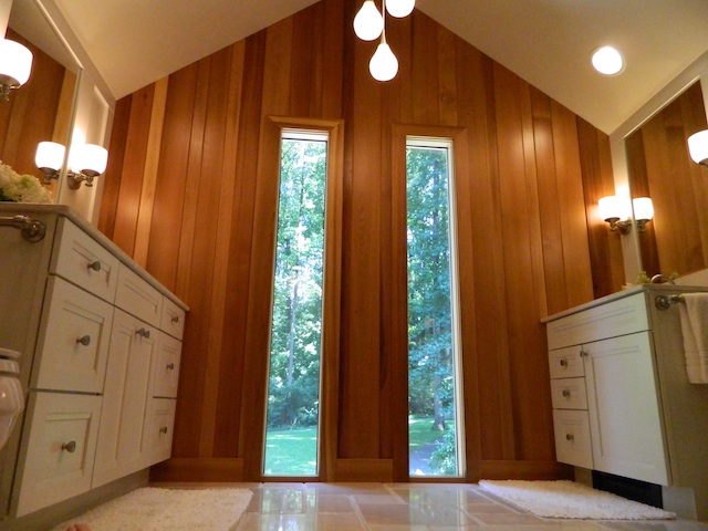
One of the things I found to be so satisfying and fun with this project was the opportunity to use many interesting and high-quality materials. From the gable end wall highlighted with clear cedar planks (further accenting its vertical lines and feeling so at home in the house’s wooded setting)….
to a Mid-Century styled ceiling fixture…to the antique botanical print framed especially for the space, the marriage of traditional and contemporary elements into a funky, eclectic mix, reflects the style of the house and its occupants.
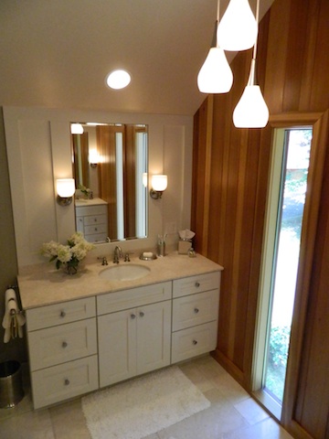
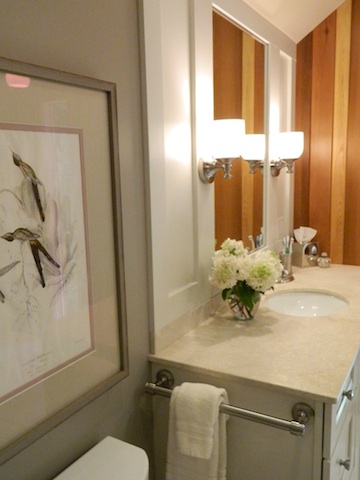
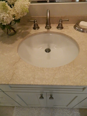


Do you have any rooms in your house that are stuck in a past decade? Perhaps a Disco Dining Room or Flashdance Family Room? 🙂 Take heart! Transformation can happen, and what used to be an eyesore can become your favorite place in the house.

Filed Under: Room for Change

The View From Here

July 11, 2012 by Erin Cochran

This week I thought it would be fun to talk about how the rooms in your house relate to one another. How does your house feel to you?  Does the flow between rooms seem seamless? Or do you feel like there are small, halting spaces that are disjointed and closed off from one another? When creating spaces in your home, it is important to remember that no room ever acts alone, but interacts and converses with the other areas around it. And what kind of dialog they have has a huge impact on how your house feels to you and everybody else.

For example, doorways can act as a kind of picture frame that creates a composition out of the view to an adjacent room…

This is important, since creating little vignettes inside of this “picture frame” makes you want to see what is around the corner.  It  invites you into the next room with its charm and sense of balance.


A small house can feel much larger if you create long interior sight lines, especially from the corner of one room to the adjacent room’s far corner–a long diagonal line across the interior box of the house. Nothing has changed in the dimensions of the space, but your perception of the amount of space that there is, is very, very different. This is something that can be created by widening doorways, or opening portions of walls for interior “windows.” Certainly this is more involved than just moving a few pieces of furniture, but if you are frustrated by what feels like a cramped abode, then this option is far less expensive than adding on. 

In addition, site lines that sweep through rooms and terminate with exterior views enhance the feeling of openness.

Your eye is tricked–with nothing to stop it–into including that outside space as somehow part of the interior.

Finally, having a unified palette of colors pulls things together in visual harmony and space perception. Rooms that relate closely to each other in color (rather than being great in contrast) can feel as though they are borrowing space from one another since they flow so well together.

Creating a cohesive whole out of disjointed rooms can completely change one’s perception of a house, and greatly increase your feeling of satisfaction in living there. What could be better than that??

These beautiful interior photos and their sources can be found here: 1, 2, 3, 4, 5

Filed Under: My Favorite Things

A Picture is Worth …Well, A Lot

June 8, 2012 by Erin Cochran

I think we all have had the experience of looking at a picture of ourselves and being a little underwhelmed …..

or surprised ….

and we can question some of our choices….

Most often we are being too hard on ourselves & noticing things that nobody else pays attention to anyway. Most of the time….


What most people don’t realize is how much photographs can help us with our houses. If you are struggling with a room that feels off to you, and you just don’t know what to do with it, snapping some pictures of the space can help you to get some distance — a change in perspective that can help you make decisions, see what is needed, and clearly see what is working and what isn’t.  And now that most of us have a handy dandy camera on our person almost all the time, this is a tool that is so easy to use, but one that is often overlooked.  Snap some pictures, take a step back to evaluate, and then use the pictures on your phone as a reference as you work on your project.

You will be amazed how much it helps!


Hilarious Bad Paid-For Photos via Ellen 🙂

Filed Under: Uncategorized

“Is That A New Window??”–A Perception Changing Kitchen Re-Do

May 24, 2012 by Erin Cochran


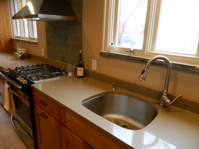
I love the unexpected things people delight in after a room is completed.  Like the perception that there is a “new” window in this kitchen….although it isn’t new at all,  just newly appreciated!

This kitchen, new in 1991, was quite the hang out for family gatherings…but the owners couldn’t figure out why no one ever sat at the table –the place in the room with beautiful sunlight & the best view.  Everyone instead always gathered around the peninsula–crowded really–with the view of the door to the garage, of all things. They acted as though that big space behind them didn’t exist. I know this to be the truth, having squeezed in there myself on many a Christmas Eve, since this is my step-father’s kitchen.

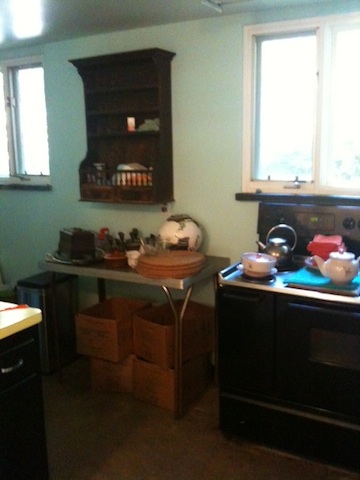
Here was the eating area before….

You can see the old kitchen was dissected by the peninsula….

and seemingly half of the space in the room was never used. Just silly.

My family asked me if I would help them figure out how to make the kitchen work better (my favorite thing to do!) and they had lots of thoughts and questions about what might be the best solutions: Should the cooktop in the peninsula be removed so it wasn’t in the way while entertaining? Maybe a high top table would make the eating area more attractive to people?  What elements of the current kitchen could be retained/re-used?

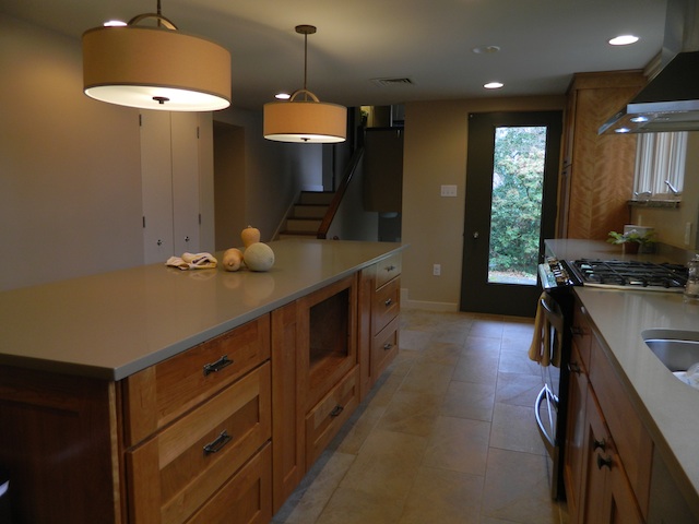
When I sat down to work on the space on paper, I knew I wanted to stretch the room along its length, making it seem bigger, creating a better focus when looking into the room from the adjacent family room, highlighting its architectural features, and, of course, putting the existing space to its best use. I am very happy to say that now the project is done, there are rave reviews, and every inch of the kitchen is well used and loved.  Whenever someone is in the kitchen, they now find themselves sitting, relaxing, and enjoying the view out of that “new” window.

The existing tile floor was in great shape, so it was left in place and we worked the palette for the new room around it. I think the new complimentary wall, cabinet, and countertop colors give the old floor a fresh and updated feel….once again, it is hard to believe it was there all along.

The kitchen sink remains in the same spot, as does the refrigerator….

 but now with the new island, the cook has his or her own space while still being able to visit with those who sit on the other side of the counter.The separate cooktop was switched for a slide in range, creating more counter space and working more efficiently for how the family actually used their kitchen.

I hope that seeing all of these possibilities inspires you to creatively think about rooms in your own house. What features does your house have that aren’t currently being enjoyed to their fullest? What  already works well?  What can be given a whole new or new purpose?  Even if you aren’t in the market for a big renovation, small changes can bring about big results.

Filed Under: Fresh Look Consultation, Redesigned for Entertaining, Room for Change

Adding On Vs. Adding More (Yes, Your House Is Probably Big Enough)

April 12, 2012 by Erin Cochran

Do you lay awake at night dreaming of the large addition you want to put on the back of your house? Maybe you picture how grand and easy life will be, with sunshine streaming through new large windows, washing over the miles of new counter space in the renovated kitchen, acres of new closet space, and cavernous rooms that are large and impressive for family gatherings and holiday parties…..

However, there is the flip side to that  fantasy–there are the inherent costs such a space would, ahem, add on –since any new space starts, of course, with the building of foundation, walls, and roof…and tens of thousands of dollars. And there is the additional cost of heating, cooling, and maintaining added space  for years to come.  In my experience, there are a lot of reasons NOT to add on, the most prevalent one being that it is, in most cases, simply not needed.  If you feel that your house is lackluster and in need of more space, I challenge you to first make the most of the house you have so you can honestly say that more space is what is needed.  A lot of times we have rooms in our houses that are seldom used, and other rooms that are completely underwhelming in function & design. Without examining our feelings any further, we respond to our discomfort and dissatisfaction by thinking we need more space.  Creativity, good design, and the principles of living simply can make a “small” house live very large….SO, before  you pay a builder a hefty deposit, we should examine how you currently live in your house and make sure that each space works as hard as it can for you and makes you swoon with its abundance of charm, beauty, and functionality.


Read the following statements and see if they are accurate truths about you and your house currently:

  • I (or someone in my family) uses each room in our house at least once a week.
  • I feel proud of the rooms I have and feel good when I spend time in them.
  • The rooms in my house relate well to one another, and there is a sense of flow throughout.
  • I think my house is beautiful and reflects who I am and how I would like to live my life.
  • Accomplishing tasks in my house is easy, since the spaces are well organized and well designed.


If you feel that all of the above statements are true of your house, and you are still ready to build on, then I would say it is the right choice. However, if you can’t say they apply to your situation, then I urge you to rethink things. It is easy to believe the lie that bigger is always better. Much like fine dining can be a wonderful, memorable experience compared to a button-popping, forgettable all-you-can-eat buffet, having a smaller amount of house that delights you with its attention to detail and fine materials can be so much more satisfying that a lot of house that bores you and costs you a lot of cash. Invest the money you were considering using for the addition to thoughtfully and intentionally improve your existing house, and you will have something of beauty, value and quality when you are finished.


Feeling cramped and uncomfortable in our current house often has little to do with the amount of space that is there, but rather how well the space is designed and appointed. Remember, you can only be in one room at a time–make the rooms you are in beautiful and satisfying to you, and your life will be the better for it.

Filed Under: Decluttering, My Favorite Things

Thinking Outside the Box

February 2, 2012 by Erin Cochran

There are many ways in which to think of your house. When frustrated with the flow and function of the interior spaces, sometimes it is helpful to envision the building as a large rigid box, with many smaller somewhat flexible boxes inside that can be shifted around and fit back together inside of the whole. The result can be a completely new relationship between the rooms, and a great improvement in the function of the home. In the whole house renovation that I participated in starting this past summer, that is essentially what we did to allow for a modern kitchen to be created, and maintain certain things that the homeowners did not want to change about the original floor plan of the house.
You may remember this house. I have written about it here and here, and I am very excited to show you the end result of the kitchen renovation, which did indeed include moving the space from one front corner of the house to the other.

What we started with was a mid century gem of a house that had been lovingly designed by its original owner, an architect himself, for his family. The house was conceived during a time when the kitchen was for those who worked in the house, not for the lady of the house herself, and the kitchen was not the hub for family gathering that it is today. The pictures of the kitchen it its original state say it all:

The kitchen had an awkward L-shape to it, and on one end was an exterior entrance which had always been used as the main way to enter and exit by the family. You can see it at the far end of this picture….

When I proposed closing this door up, and instead turning the opening into a window so that we could have a workable kitchen layout, the response from my clients  was a polite but firm  “Hell No.”

So, we were temporarily at an impasse.

Because I didn’t want the owners to go through a costly renovation to have a pretty kitchen that would essentially function no better, I went back to the drawing board.

In our conversations about the house, I had learned that while the kitchen door had not been intended to be the front door of the house, visitors interpreted it to be just that. If they had not visited before, or weren’t instructed to do otherwise, they often came here to knock, since it was the most visible door when you approached the house. The true front door was hidden from this angle, and therefore very seldom used.  In the picture below you can see the kitchen door as seen from the driveway….it is the one on the right, propped open in this picture taken during construction….

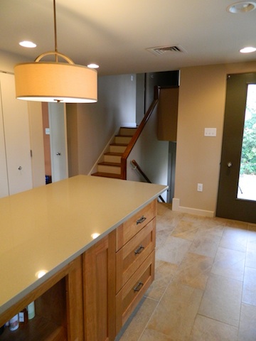
Since it was unthinkable to have this door not be a door (for functional and sentimental reasons), then why couldn’t we then solve two problems at once and create an entry/foyer to be just inside of this opening, and then shift the kitchen down the front wall of the house, so that it would absorb the space that was once the entry hall??  The kitchen could then encompass a much larger and more functional space….

The answer I got this time was a resounding “YES!”

Victor Burgos, our so very knowledgeable, always patient,  favorite general contractor, was there to assure that the changes could be done, and we started working out all of the details that would need to be addressed. It is amazing to me that the view of the original front door went from this:

To this (a great but sadly blurry picture of Victor and me going over details during the demolition)….

to this:

Wow.

And here are some more……

Before:

and after:

(The curtained window above in the “before” is the very same window here in the upper left of the frame.)

Before:

and After….

I am so pleased with the way this project turned out. The craftsmanship and materials are just beautiful.

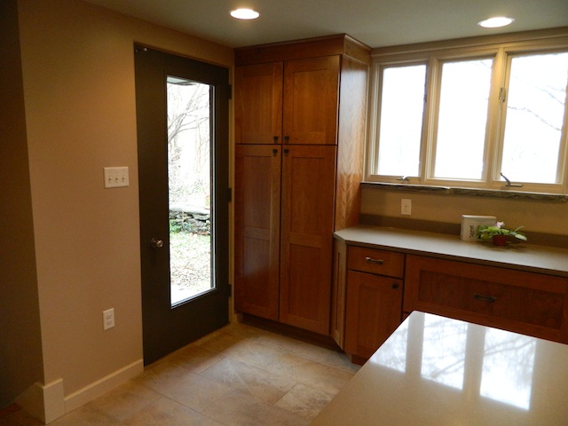
What was once the “front” door to the house is now a beautiful kitchen door, complete with a new light cut in it (asymmetrically placed to be true to the vintage of the house) to allow more natural light to enter the space.

And the staircase, which wasn’t able to be fully appreciated before in the dark front hall, now adds so much architectural interest to the kitchen.
So, don’t allow yourself to be boxed in! Creative thinking and not being married to the way things are, can help you to look forward to the possibilities of what could be!


Filed Under: Historic Buildings/Houses, Room for Change

Boredom in the Bedroom

September 29, 2011 by Erin Cochran

Well, I don’t know what you thought this post might be about…..
but boredom in the bedroom, whatever kind we may be talking about, is not to be tolerated!

Just this past week, something made me take an honest look at my own bedroom….and I began to YAWN.

Now, it wasn’t always this way. I have loved my bedroom and the things in it for a long time, but with all the other distractions, responsibilities, and things that just pull my attentions elsewhere, there hasn’t been any love given to the space for the past few months. When I  took a step back and evaluated the state of things, the words “anemic” and “pathetic” readily came to mind–not really the vibe I was after.

It was time to get to work.

So, what about your Master Bedroom? Let’s talk about what a Master Bedroom should be, and what it should not.…

  • A master bedroom is meant to be a personal retreat from the world. When you walk in and shut the door behind you (and the door should preferably have a working lock~ ahem) you should be able to feel you are removing yourself from your day to day stressors and giving yourself space for quiet.
  • A master bedroom should not contain anything that pertains to your work.  I have redesigned bedrooms for clients who reluctanly went to bed at night because the space had a desk piled high with things needing their attention. It was the last thing they saw at night , and it greeted them first thing in the morning. No wonder they looked so tired.
  • While the room should not contain things that irk you, it should contain things that delight your senses: soft lighting, a variety of textures (think satiny sheets and nubby chenille throws), colors that you find soothing, fresh (but not overpowering) scents, and flowers and /or plants that bring life and additional color to the room.
  • And, most importantly, a master bedroom should contain order. If you have a pile of stuff on a chair in the corner, not only will you not have a place to sit, but you will feel annoyed. Annoyance is so NOT serenity.

I am glad to say that my bedroom is no longer a snorefest.

I bought some wonderful 300 count sheets in a soothing hue, found a decorative pillow that picks up some of the detail in the headboard and adds a punch to the existing color scheme.

Add some cuttings from the Ninebark shrub and Mexican Oregano plants right outside my front door, and the room comes to life.

Now the space is one that I am happy to retreat to after a long day.

Filed Under: Fresh Look Consultation, My Favorite Things

Take A Picture~It’ll Last Longer!

May 26, 2011 by Erin Cochran

As a designer, there are a few things I always have with me whenever I meet with clients, things I could not live without. None of them are surprising…bet you would guess that I always have my trusty tape measure along &  my paint color paddle. Yawn, yawn.
Something that is SO important whenever you are trying to create a feel or look in a space is a visual reference. You know, A PICTURE! And now that most of us have a handy dandy camera on our person almost all the time, this is a tool that is so easy to use, but one that is often overlooked.

It is really hard to exactly remember what a room or piece of furniture looks like. Like a lamp….I wish I could find something that would work with my office lamp. SNAP!

That was so easy! Now I have the lamp in my pocket whenever I want to see it with something I come across in my travels.

Right now I am getting ready to plant some pots that I just moved to a new spot in my garden. I really don’t know what I want to put in them, but hey! , if I have a picture with me I will have a much better idea of what I may like in the space while I am in the garden center.

Views from different vantage points will help me to see what may work best for the plantings….

So, next time you are working on a decorating or gardening project, don’t forget to grab a few images before you go shopping. You will be amazed at how much help it is to you!

Filed Under: My Favorite Things

  • Page 1
  • Page 2
  • Page 3
  • Go to Next Page »

Footer

About

Revealing Redesign is a Pennsylvania-based interior redesign studio serving homeowners in Delaware and Chester Counties, northern Delaware, and beyond. Since 2006, principal designer Erin Cochran has helped clients transform frustrating, outdated rooms into spaces that feel calm, personal, and deeply livable — honoring the character of your home while redesigning it for the life you live now.

484-840-3542

PO Box 84
Chester Heights, PA 19017
hello@revealingredesign.com

LET’S GET SOCIAL

  • Facebook
  • Instagram
  • YouTube

FOLLOW REVEALING_REDESIGN

The Story of a Living Room…a mishmash of images fr The Story of a Living Room…a mishmash of images from the project we finished this week ☺️💕

#yourhousewillfinallyfeellikehome 🏡
Because a home can be beautiful and still drain yo Because a home can be beautiful and still drain you.

A home that’s frustrating will quietly wear you down.

But a home that feels like YOU? Where each space reflects the movements of your daily routine? That changes your life. It restores you. It gives you daily joy. Your House Will Finally Feel Like Home. 🏡♥️
Happy Labor Day Weekend, friends! I hope your summ Happy Labor Day Weekend, friends! I hope your summers were full of all the blessings and beauty that the warm weather brings 💗
Our little cottage on Chincoteague Island has had Our little cottage on Chincoteague Island has had another wonderful summer season…and we are so grateful to be able to host so many lovely people. Here’s just a few things one of our recent guests had to say ☺️ 🏖️ 🌊 

If you ever are thinking of visiting this quaint little town, reach out to us!

OR if you want to spruce up your Airbnb or short term rental, we help with that too! 

#chincoteague
Because home is important—but creating the feeling Because home is important—but creating the feeling of home can sometimes feel elusive or difficult to achieve … 🏡

We do what we do because we love helping you recreate rooms— 
(ones that up to now might have felt frustrating and out of date) 
so that they can be spaces that make your heart lift, encourage togetherness and support the way you’ve always wanted to live within your four walls.♥️

#yourhousewillfinallyfeellikehome 🏡
Our clients had been mentioning that their primary Our clients had been mentioning that their primary bedroom was next on the list—ever since we finished their kitchen a few years ago. 😊

We know that they have a love for black & white, and deep, moody interiors—so we were excited when we found this amazingly dramatic mural for the feature wall in their space. 

Once that was in, the other elements fell into place to create this lovely space—the perfect place to cozy up this fall… & every other season. ☺️
CONNECT WITH US
  • Home
  • About
  • Work
  • Services
  • Process
  • Journal
  • Inquire

Copyright © 2026 · Copyright © Revealing Redesign · Site Design by FGD