All Finished! (*whew*) Our Brick Cape Cod Gets Her Big Debut
/Just this week, after many months of hard work, careful planning, and many answered prayers, our little project house was put on the market! WOOOO HOOOO!
I am very excited to show you some of the before and after pictures today!!
I know you remember her forlorn facade from before:
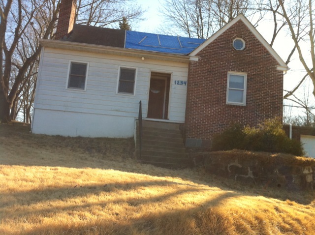

But take a look at her NOW!
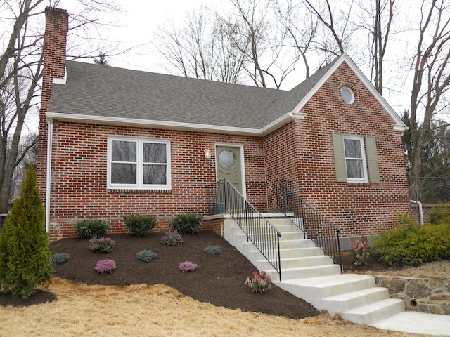
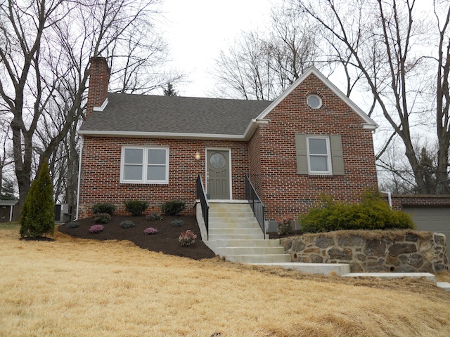
As you can see there are now welcoming front steps with a rail at each side (you can read more about that in this post), a new roof where a blue tarp used to be, and beautiful colorful landscaping. Her front is so pretty and clean now too, due to fresh paint, a set of shutters, and a nice light scrubbing with the power washer. (If you are wondering what happened to that funny white siding/strange addition, you can read about that here)
Throughout this process there have been pleasant surprises, bitter tears, grumbles of frustration, shouts of joy, expensive shopping trips, slips and falls (don't ask), and now...... a wonderful result.
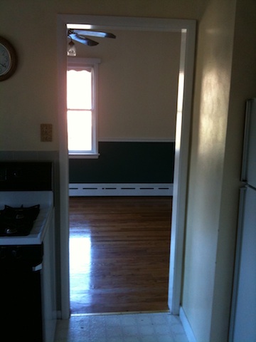
When we first viewed our little house, there were lots of things to weigh out and lots of things that needed attention. First the roof was replaced. When we were no longer open to the elements and without heat, it was time to focus on the existing kitchen. The cramped and dark room lacked a dishwasher and and needed updating throughout. Older appliances and an awkward layout also didn't seem like it was going to make anyone feel at home...
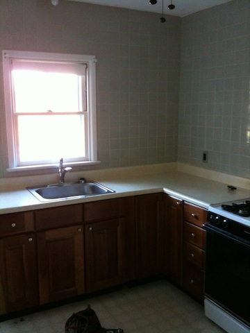
Not to mention the cramped doorway that led to the dining room.
A totally redesigned kitchen with quartz countertops, new hardwood floors, all new appliances and cabinets, and a repositioned larger doorway make a huge difference.
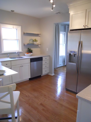
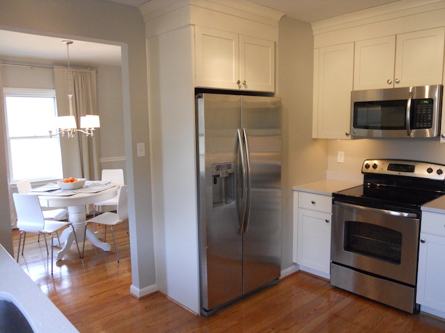
Pretty, bright, and sparkly!
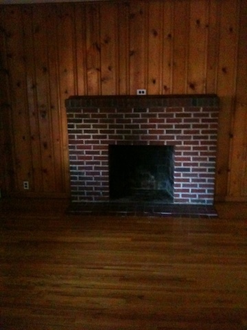
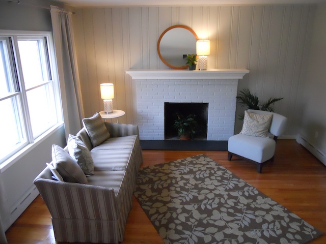
The living room had a fireplace, but it lacked a mantel shelf, had cracked and crumbling tile at the hearth, and was surrounded by dark knotty pine panelling.
With paint, beautiful carpentry work, a new stone slab, and staging for the upcoming showings, it looks like a whole new room:
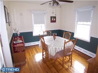
The dining room also needed a little pick-me-up. This is how it looked before.
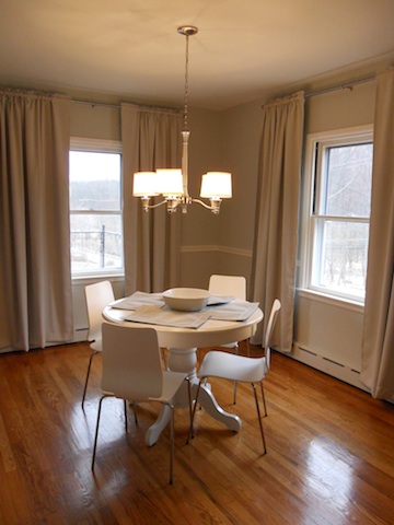
And now it has a clean look that welcomes buyers to envision using the space to sit down for soup and a sandwich or to have an elegant meal with guests.
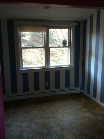
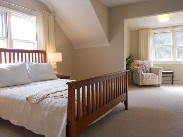
The final room I will show you for today is the Master Bedroom. It originally had been painted with bright pink paint in one area, and blue and white stripes in the dormer space.
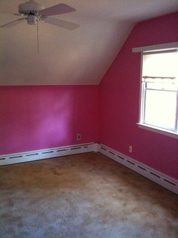
Now with beautiful neutrals, new carpeting, and the right furniture and accessories, a buyer can see all the potential this room has to be a restful retreat.
I will be back very soon to show you the rest of the redesigned spaces!
What do you think? Do you like the look of our freshened up cottage?

